The third prompt in the logo challenge was to create a logo design for a tech start up.
TripleWP is a new app that simplifies people’s use of WordPress and got it’s name because it makes it three times faster to design and update their site.
The suggested colours were blue, white an black. The ‘client’ referenced cloudfare as an example logo (cloud shaped).
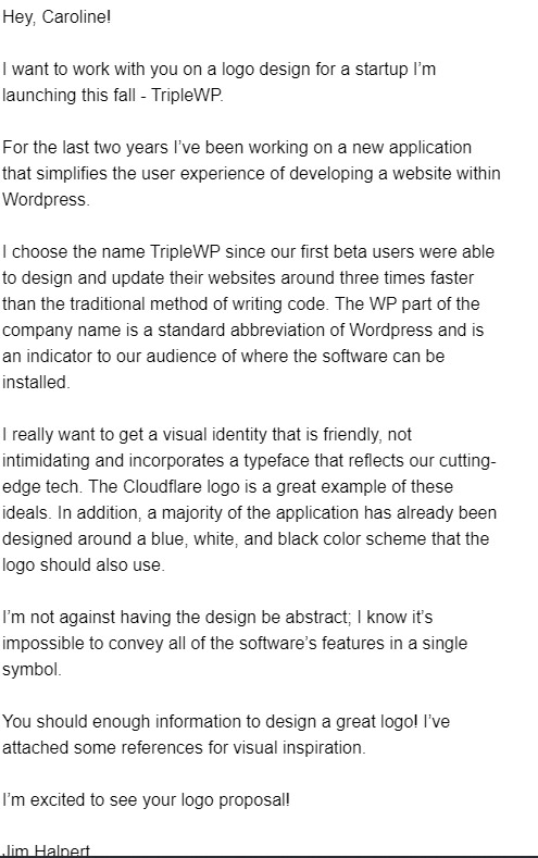
I uhmmed and ahhed about the typography around WP, I didn’t want it to be too close to the actual WordPress font, because this is a stand alone app, but I did want to differentiate it from the word Triple.
I wanted to make something about the 3 times faster, but wanted to avoid just using the wording. I decided to create a cloud style shape, but with 3 overlapping circles, using some drop shadow and inner shadow to show some depth. I used a lightning bolt on these three circles to indicate the ‘faster’ element.
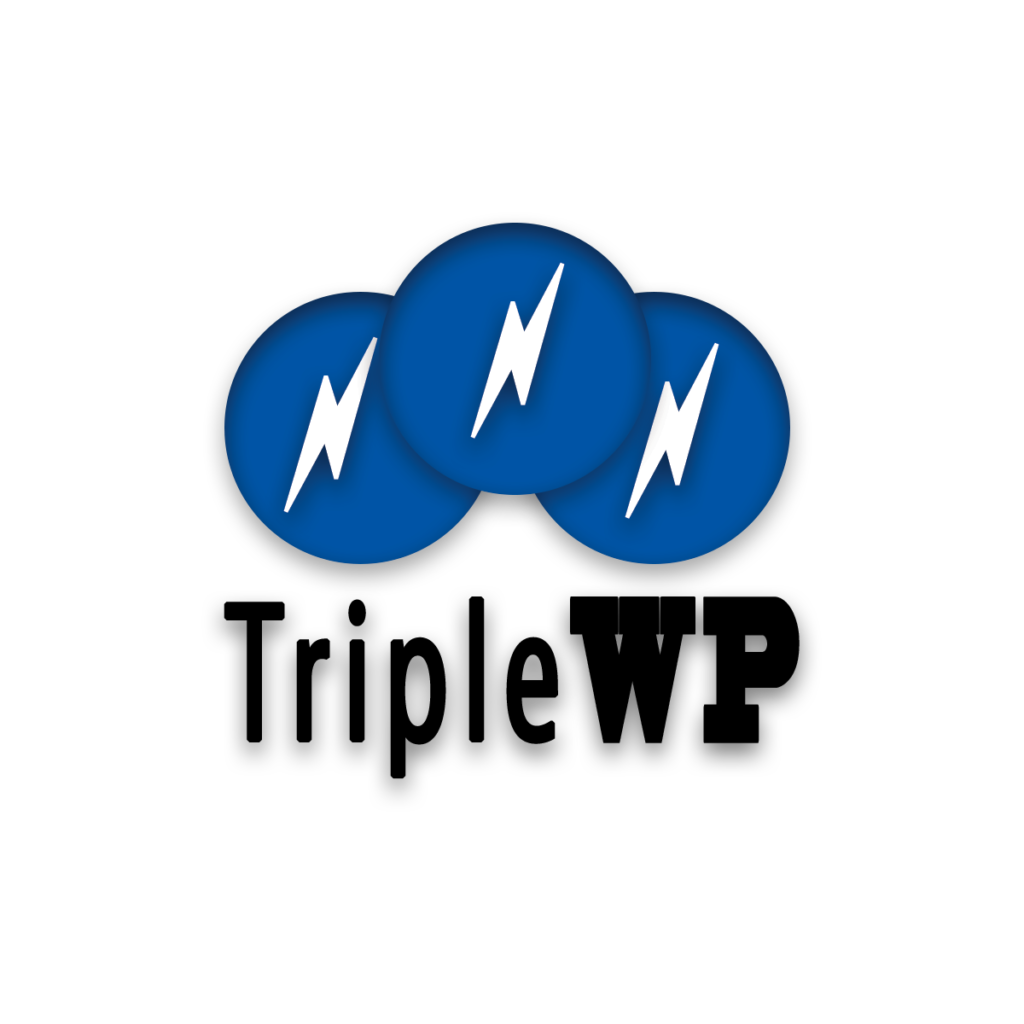
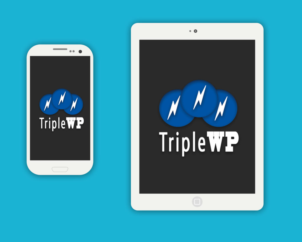
I’ve put a mockup on a phone/tablet and created a variation with dark text for light backgrounds as well as the main logo set against a dark background with light writing.
In the examples below I have done a black background and white background, but I have a transparent PNG version to work against any colour.
