
Today’s logo challenge was to create a logo for Zelda Guide. The brief mentioned that they wanted their own visual identity and they didn’t want to use the stereotypical Zelda typeface. They wanted to ensure any symbol used was something from the Zelda franchise and that color palette was familiar too.
They mentioned wanting to get into merchandising and said that one of the first things they were looking at releasing was T Shirts. They suggested a maximum of 3 colours.
I’ve played Zelda, but I am not the biggest fan, but I do remember some of the visual references.
I decided to stick to the familiar Green and Yellow that’s synonymous with Zelda.
I took some time to look at some of the symbols most relatable to the game and decided on the use of the Tri Force. It’s a series of 3 equilateral triangles and is used elsewhere so not something that could get them into trouble from a branding point of view.
I created a larger logo, best for merchandising and a long logo, which could also work on merchandising, but would work with their website too.
I also did versions with and without .com.

The larger logo with/without .com and the long logo. Transparent PNG also created to go with any background.
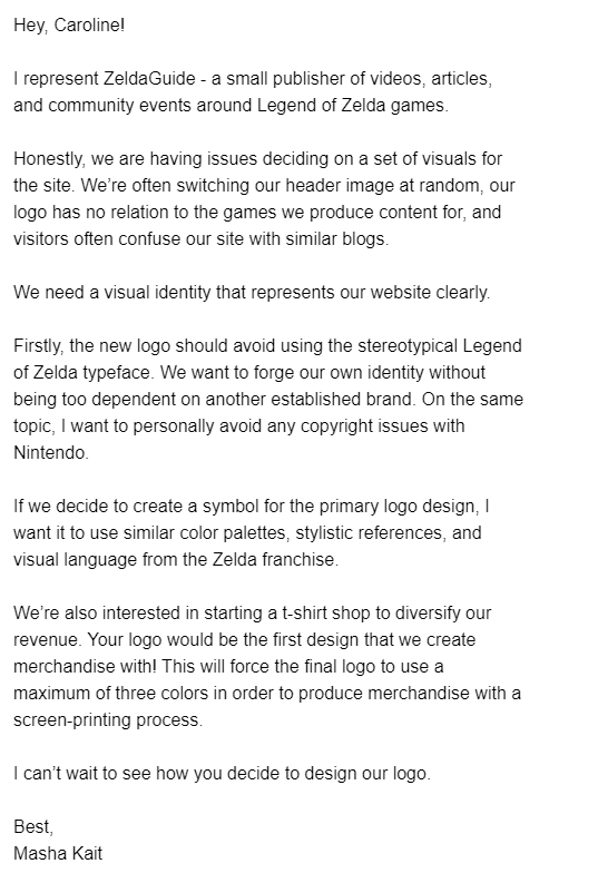
T-Shirt mock up with the long logo on both a light and dark T-Shirt
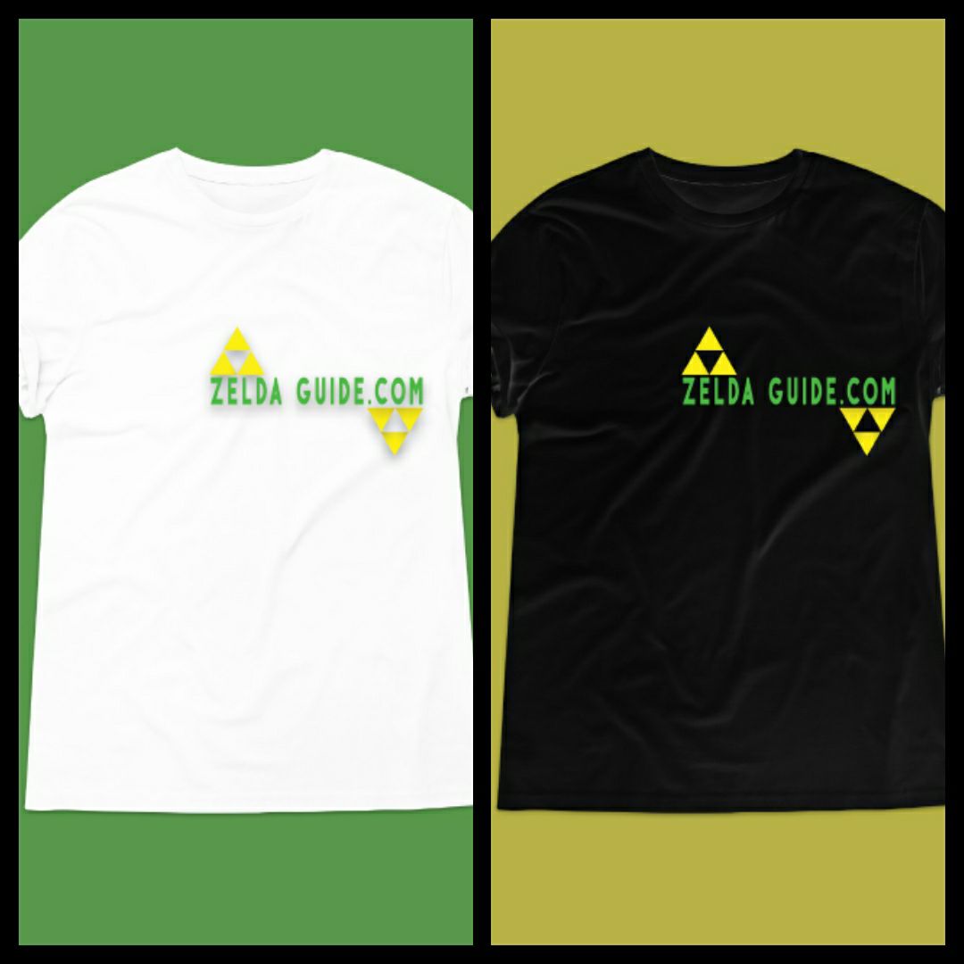
T-Shirt mock up with the larger logo on both a light and dark T-Shirt with and without .com
I found this challenge interesting and surprisingly challenging. It is easy to create a triangle in photoshop, but takes a bit of practice to keep it as an equilateral triangle and to get it all lined up and centred. I used drop shadowing to give an extra sense of depth on the white background/white T-Shirt, but it’s not needed on the dark/black background due to the nice contrast.
I chose a nice clean simple font and avoided trying to replicate the Zelda font.