
I have just started to go through a training course I purchased through Udemy. I have always loved doing creative stuff and I do my art every day, but I have always been interested in learning more about graphic design. I have the full Adobe Creative Cloud and signed up for Graphic Design Masterclass – Learn Great Design by Lindsay Marsh.
I’ve only just started going through the introductory videos and a bit about typography, but one of the recommendations Lindsay made was to practice regularly and take part in challenges such as logo challenges. I tried to sign up to the one she referenced in her video, but the signup wasn’t working so I found another one with Logo Core. I signed up to join and every day for 30 days I will receive an email brief from a fictitious client so that I can have a go at designing.
The first challenge is to create a logo for a cosmetics company, the brief was:
I haven’t done a challenge like this before so I did do a search on their website and online to see some of the examples of what people had done in the past. It was really interesting to see the wide range of concepts people came up with.
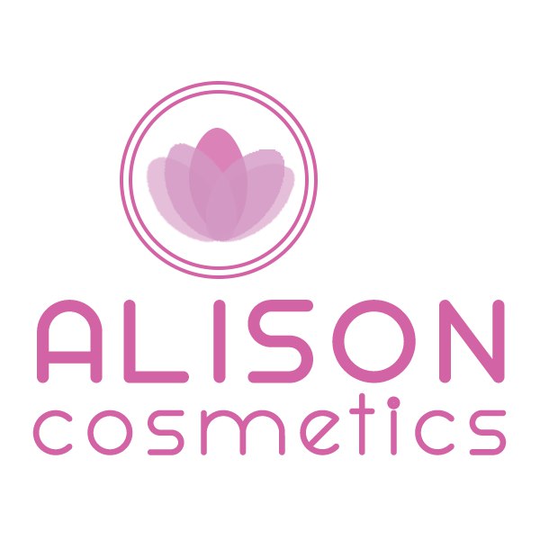
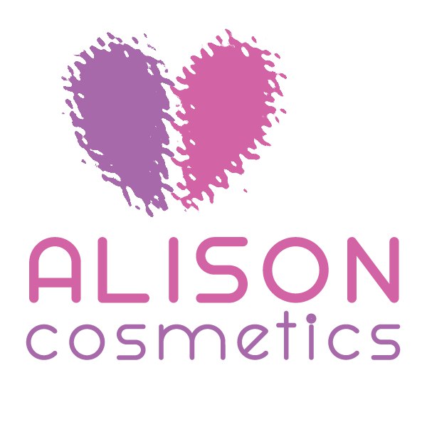
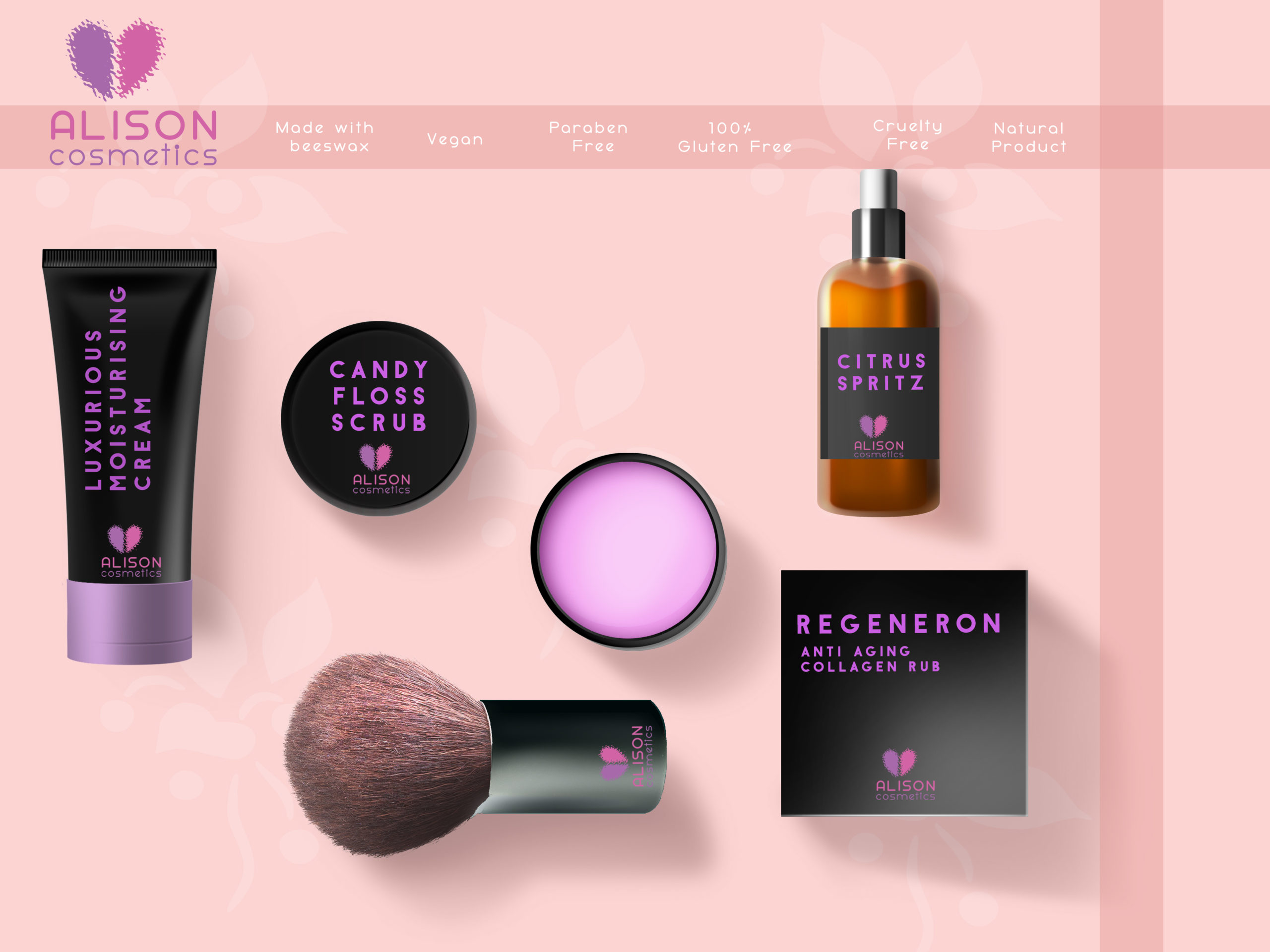
The first concept I came up with was to use the suggested colours and make something of a logo above the I. It looked okay when large, but didn’t do well when it was smaller, it had the issues that she the brief had mentioned. I decided that the colours and weight of the words needed some work and the logo element needed to be bolder. Given the brief was about cosmetics, which are vegan and the website they suggested to look at mentioned it was cruelty free and natural, I was drawn to the idea of a heart, due to it being an organisation that cares. I didn’t want just a plain heart though so I drew a half of a heart and used a filter to give it a ripple effect at the edges. I coloured one half pink and the other purple in light of the suggested colours and placed above the I. I used some guide markers to line up the words in the logo and changed the spacing between letters for more clarity.
A big part of doing this is also to learn how to use Adobe Photoshop better so I found a site with some free product mock up files and chose one as a starter.
I chose this one because it had the sorts of products mentioned in the brief and had a soft pink background.
I sourced this from https://mockuptree.com/free/cosmetic-mockup/
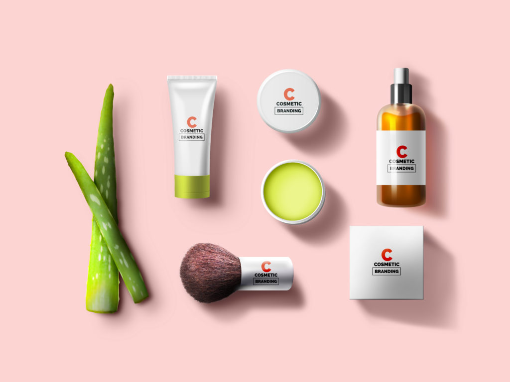
I played with this mock-up a little bit further by dropping the aloe vera, moving some of the items around, adding some flowers to the background and changing the green for the bottle cap and cream to a more suitable colour. I then set about adding details for the cosmetic company and putting the logo on the packaging, to check it looks okay. I added the logo in the top left too and added a ribbon at the top and right to allow me to add the info about it being vegan/parabin free etc. Once saved I was pleased with it, but the brief mentioned a black background so I modified and did a second mock-up with the packaging black to make sure it worked on that too.

Overall I am happy with what I achieved. I had a few other ideas, but as this will be a daily challenge, I didn’t want to go too crazy on it, but I am looking forward to tomorrow’s challenge.
Pingback:Lockdown 2 Day 6 – IWrote.uk