
Today the challenge was interesting. A Visual Effects Studio who are currently split into two wanting a logo that would represent both elements of the company and can be modifiable in the future if they choose to create new divisions.
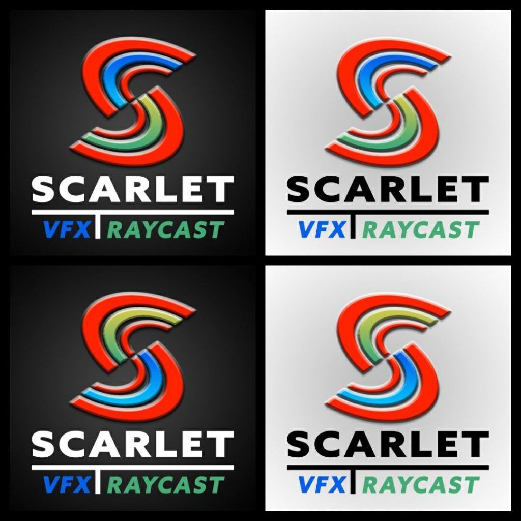
For this I decided to focus on the letter S – I created a series of curve and duplicated to create the S, the top and bottom curves of each area are a scarlet red, the centre curve represents the colour for that division.
I’ve created this so the S could be rotated and colour coded the division to the centre curve.
The idea being that the VFX division branding would have the blue on top and the RAYCAST division branding would have the Green on Top.
Should they become a company with many divisions, it could be that just the top centre curve is colour coded with each division having it’s own colour scheme and the division name appearing under the word Scarlet in that colour.
Organised my PSD this time with grouping and layers to make it easier to change elements with ease.
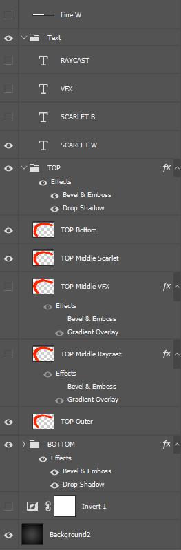
Layer setting snapshot.
To show how easy it is to change from blue to green on the centre or the base scarlet red.
How easy it is to show/hide text elements and line elements etc.