Today’s logo challenge was to do a logo for a restaurant. This was very involved as I decided to do this from scratch.
At first I drew the logo in Procreate, it has a function to save as a PSD so my idea was to do the illustration by hand, then tidy up in Photo shop, only it didn’t quite translate the layers and I wasn’t happy with it.
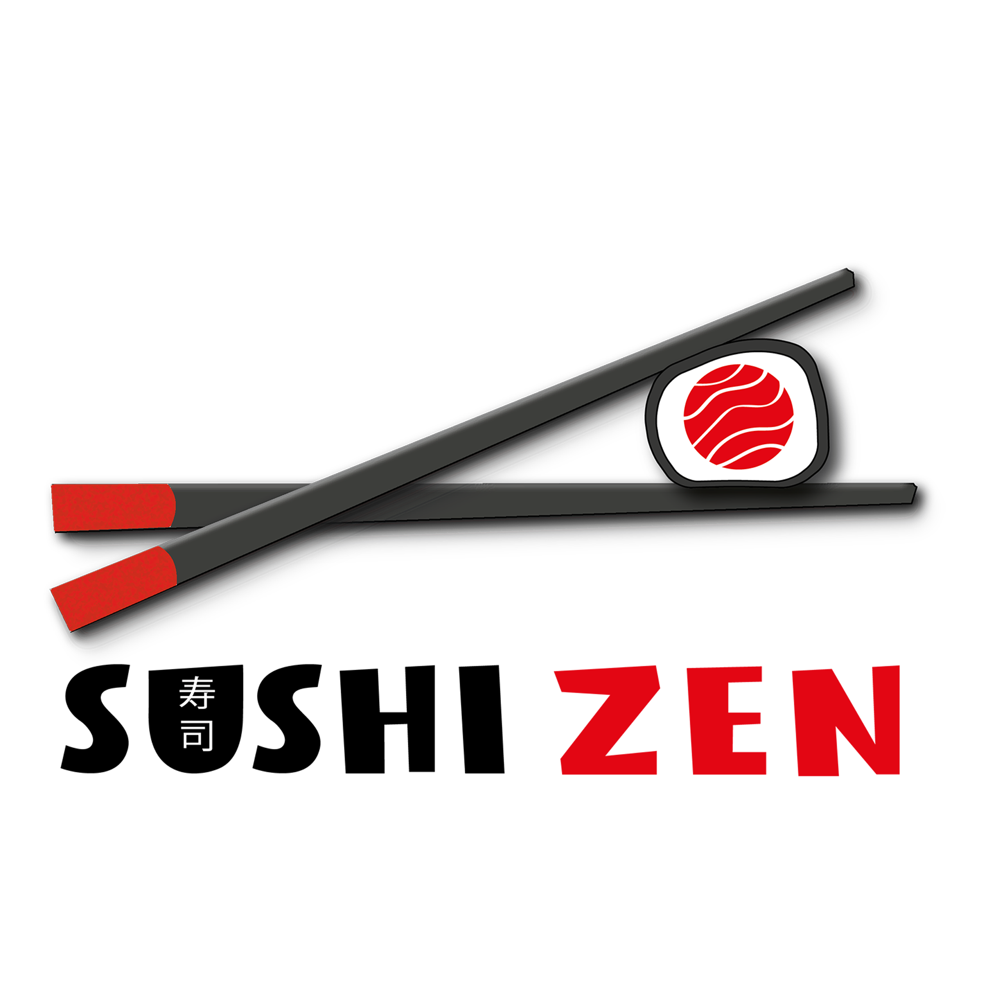
So I took the plunge to have a play in Adobe Illustrator to make the chopsticks and the sushi.
Colour wise I wanted to stick to black white and red (though the chopsticks are a dark grey) to stick to the colours of the Japanese flag. The red centre of the sushi, is the circle of the Japanese flag, with a texture added to make it look like fish.
I haven’t really used illustrator before so it was a huge learning curve on this one, spent a lot longer on this than I anticipated, but was a good learning exercise.
I also created signage and menu mock-ups. The Japanese writing in the U is the word Sushi in Kanji.
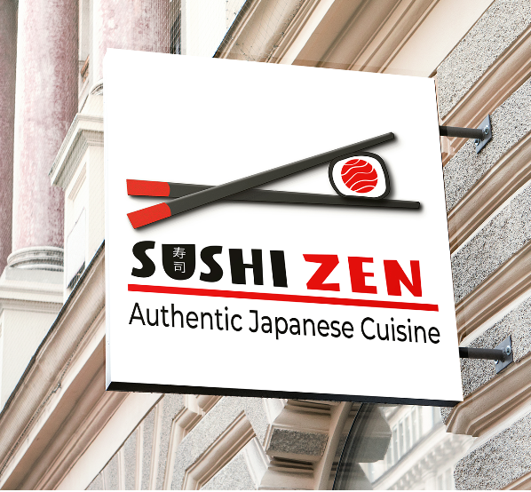
Restaurant Sign Mock-up

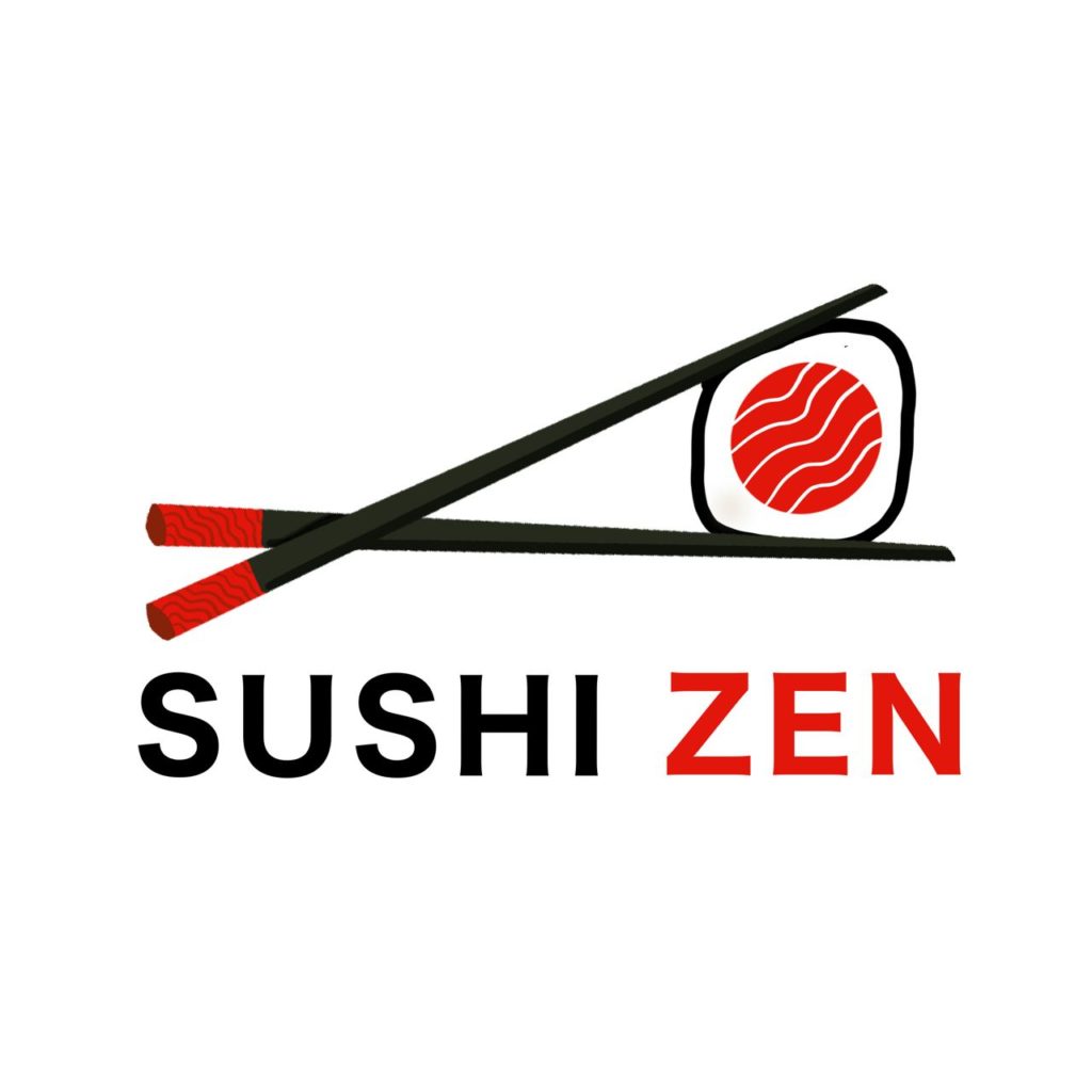
For reference the original hand drawn sketch in Procreate (which I liked, but had some issues with the transfer into Potoshop)