
Been a really busy day today finishing up some training, so didn’t get as long as I would have liked to work on this.
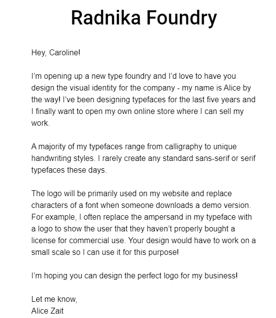
Interesting one this one, a logo for someone who designs typefaces. They mentioned that they generally do fonts such as calligraphy and handwriting, so I wanted to emulate this in what I put.
I created a Circle within two rotated squares to emulate a grid and put the letters inside, making sure they all lined up to the edges of the circle.
I added a red quill at the side.
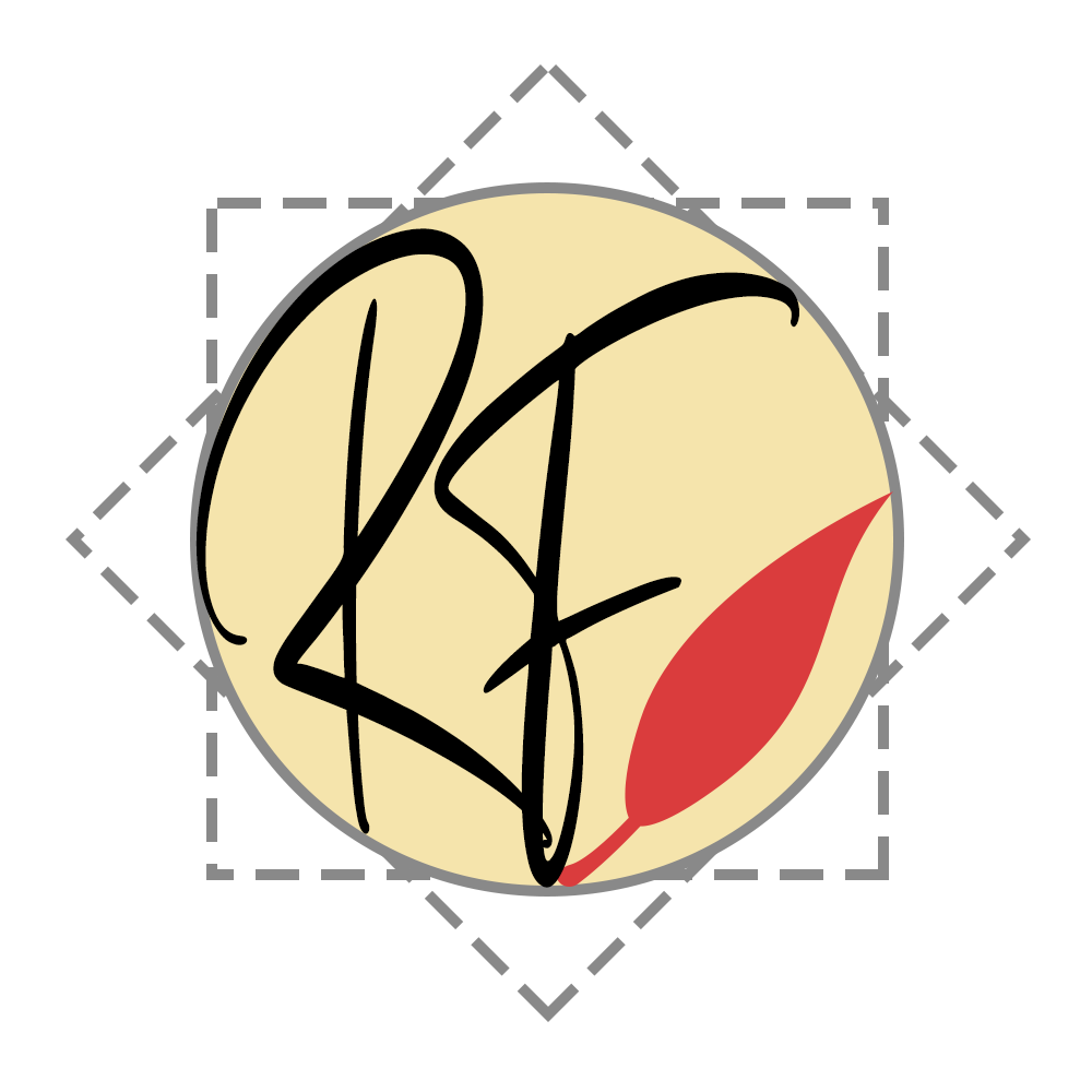
They mentioned that they sometimes replace the ampersand with their logo, so it needed to be resize-able so I did check how this looked with at a smaller size.
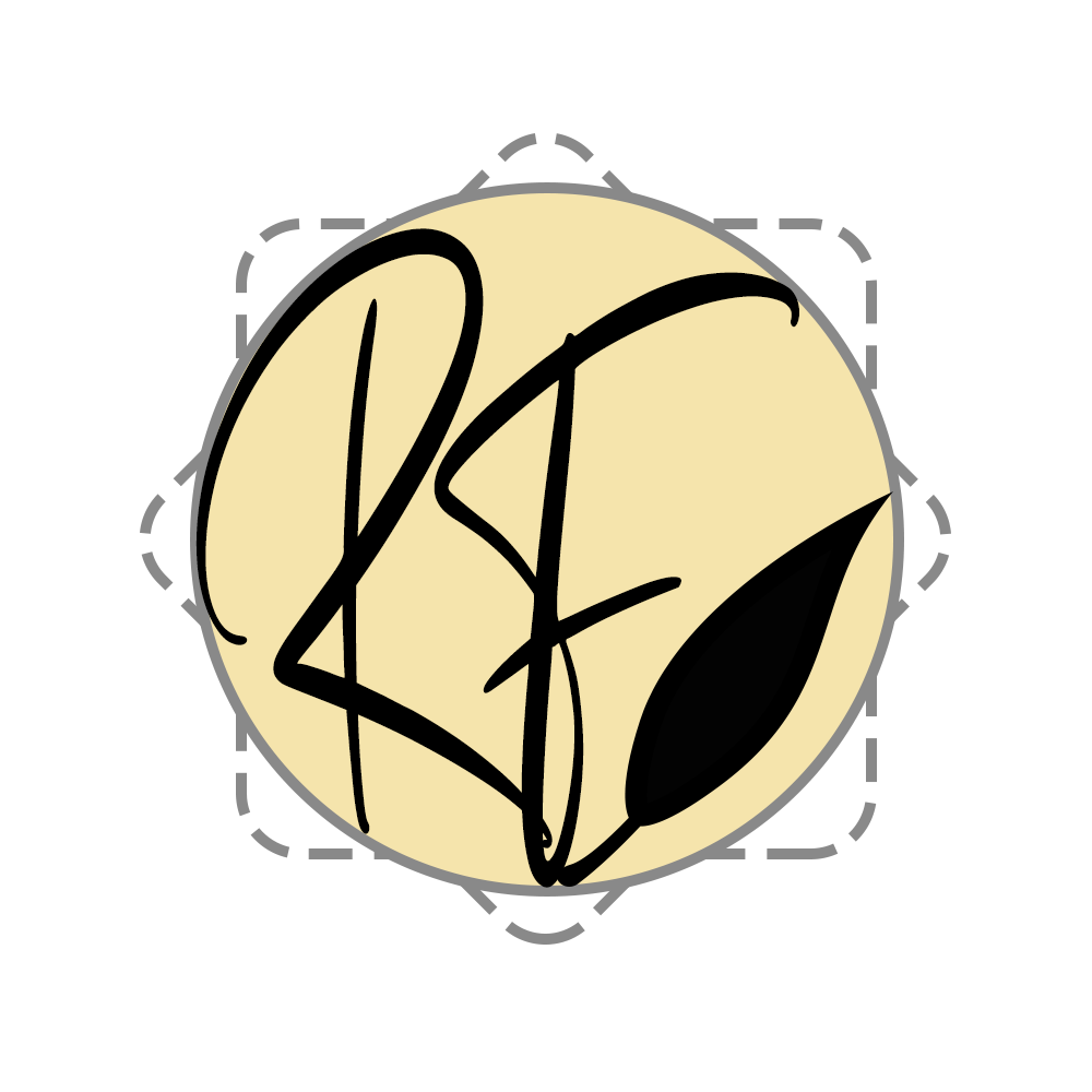
Initially the quill was black, but it made the F look like an E

Logo Challenge – Day 14